Form & Function
One idea. Many ways to show it.
THE CONTEXT
A question
worth exploring.
THE BRIEF
Form & Function is a concept identity for a Berlin design forum: three days of talks, workshops and open studios. The brief is to create a confident visual language that can work just as well on a programme cover as on a small social post.
THE DESIGN CHALLENGE
Make a memorable identity with a small, usable set of rules. A campaign team should be able to create new assets without recreating the design from scratch every time.
An original portfolio concept. The screens use illustrative content and sample data.
THE APPROACH
The decisions
behind the details.
- 01
Make the message the main event
Direct typography and short phrases give each format one clear point. Generous margins keep the identity readable from a distance or on a phone.
- 02
Use colour with a purpose
Charcoal, terracotta and warm paper create contrast between events and formats while holding the campaign together. Architectural linework adds a recognisable secondary element.
- 03
Design the adaptations together
Posters, the programme, social posts and presentation covers were developed as a family. The guidelines show how type and colour carry the identity into new formats.
A closer look.
Five connected views. Open any image to see the details ↗
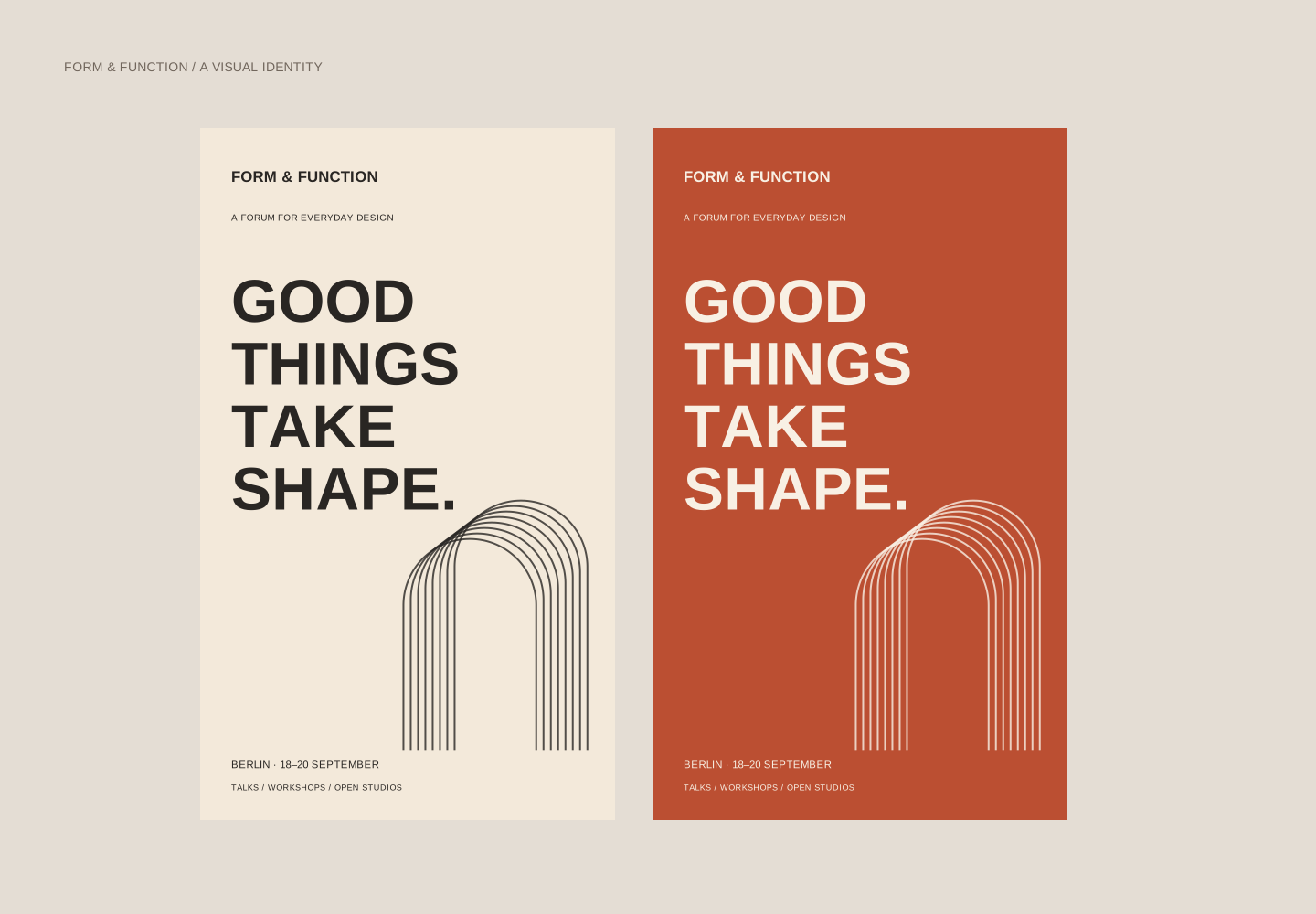
The campaign in two voices
A pair of poster treatments introduces the event identity, schedule and graphic language.
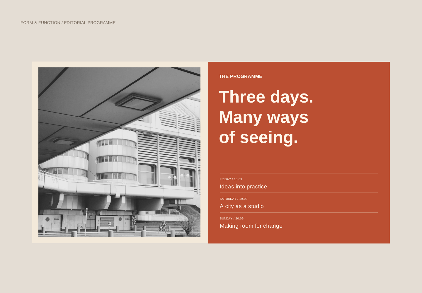
A programme you can navigate
A photographic opening spread pairs a clear event introduction with the three-day schedule.
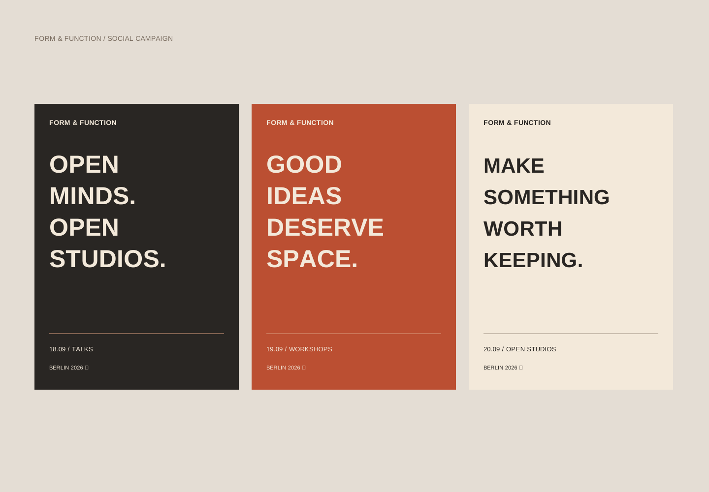
A series with a shared signature
Three social executions use distinct messages with consistent typography, spacing and event details.
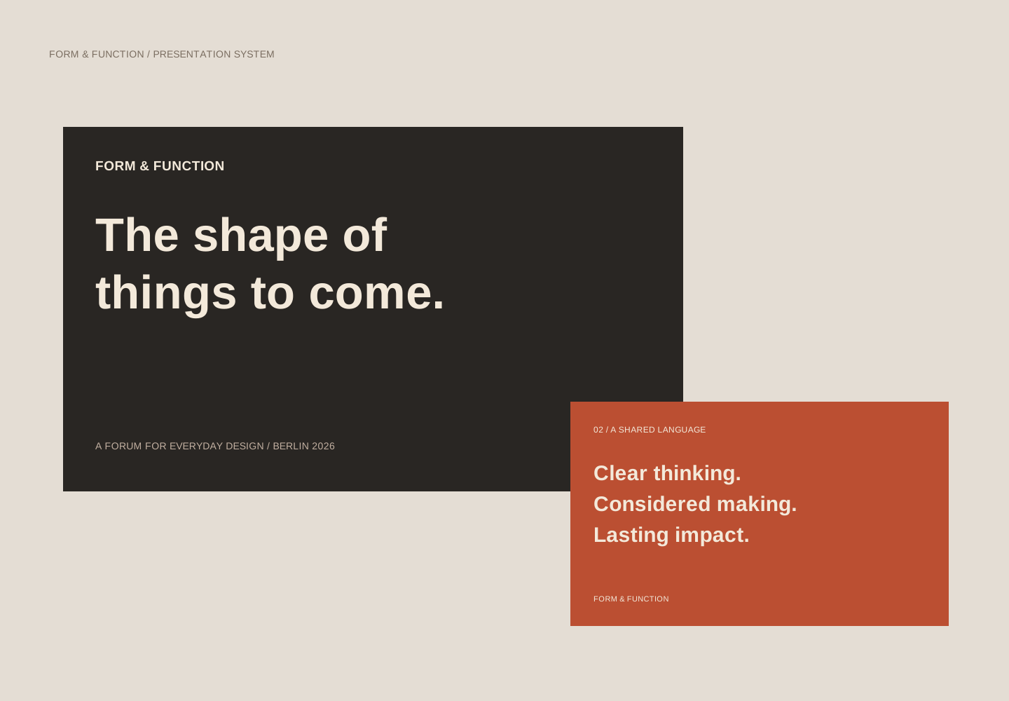
An adaptable presentation system
Cover and section slides translate the identity into a format for talks and internal communication.
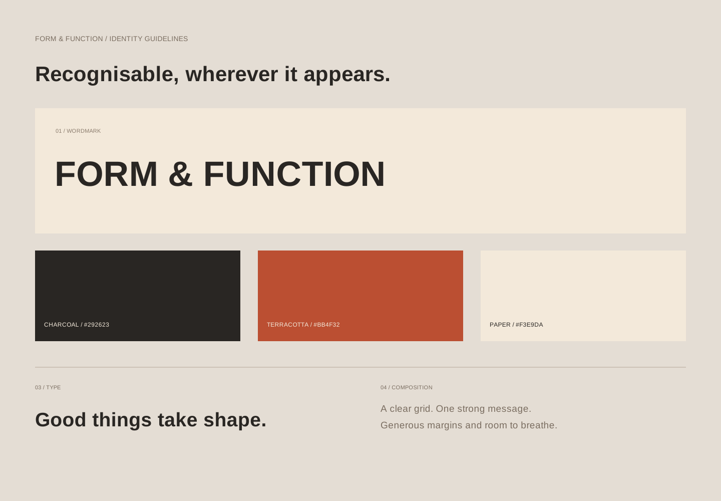
The essential identity rules
Wordmark, palette, type and composition rules form a practical starting point for further assets.
REFLECTION
Where this
goes next.
The result is a coordinated set of print and digital applications. Before production, the artwork would need physical print proofs, contrast checks for each colour pairing and final event copy.
- Does the event name remain legible at small social sizes?
- Can the programme be scanned quickly on paper?
- Do new compositions still feel like part of the same campaign?
Photography by Pavel Nekoranec, via Unsplash. Full image credits.