Signal
A little more room for the story.
THE CONTEXT
A question
worth exploring.
THE BRIEF
Signal is an independent publication about spaces, objects and everyday design. The concept explores how a strong editorial identity can make discovery feel natural and long-form reading comfortable.
THE DESIGN CHALLENGE
Give stories a distinct visual voice while creating a flexible structure for an editorial team. The same system must support a feature-led homepage, topic collections and quieter article pages.
An original portfolio concept. The screens use illustrative content and sample data.
THE APPROACH
The decisions
behind the details.
- 01
Let the feature set the pace
The homepage pairs one photograph with one clear editorial idea. Supporting stories come afterwards, giving the reader a deliberate starting point.
- 02
Build a comfortable reading rhythm
A narrower reading column, clear metadata and restrained navigation help the article carry the experience. Related reading appears after the story.
- 03
Make a system editors can use
Feature cards, pull quotes and story lists share predictable spacing and type. Mobile layouts preserve their hierarchy without shrinking a desktop composition.
A closer look.
Five connected views. Open any image to see the details ↗
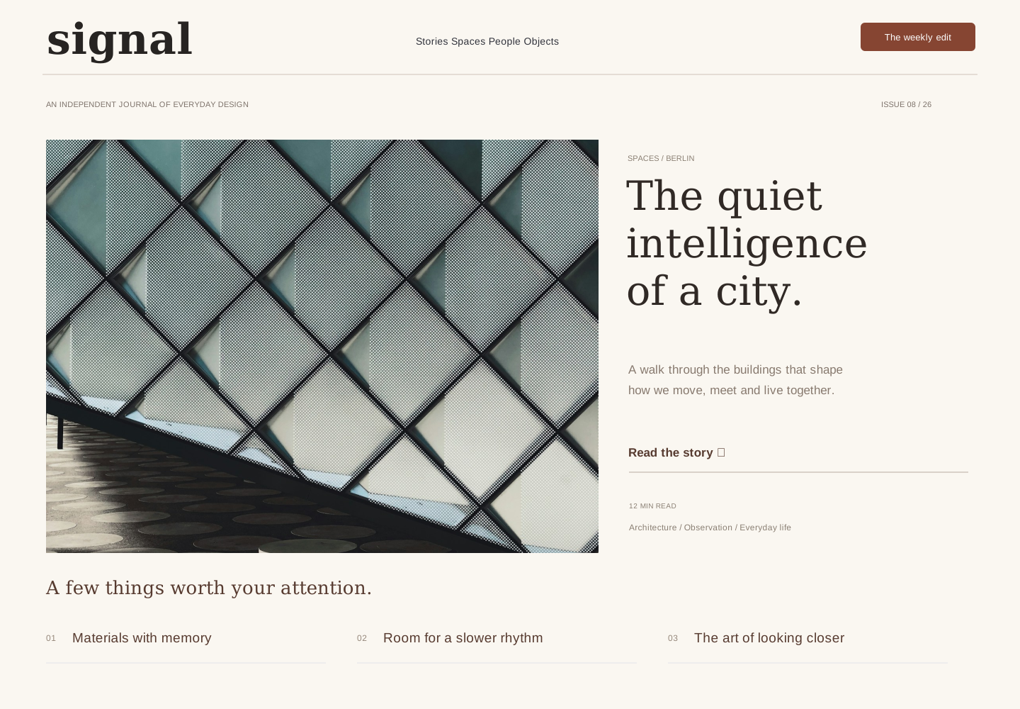
The front page
A strong lead story balances architectural photography with clear navigation and a short list of secondary reads.
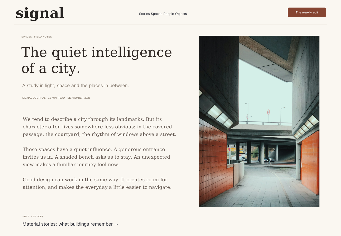
The long-form reading view
A comfortable text measure, useful metadata and complementary imagery give the article room to breathe.
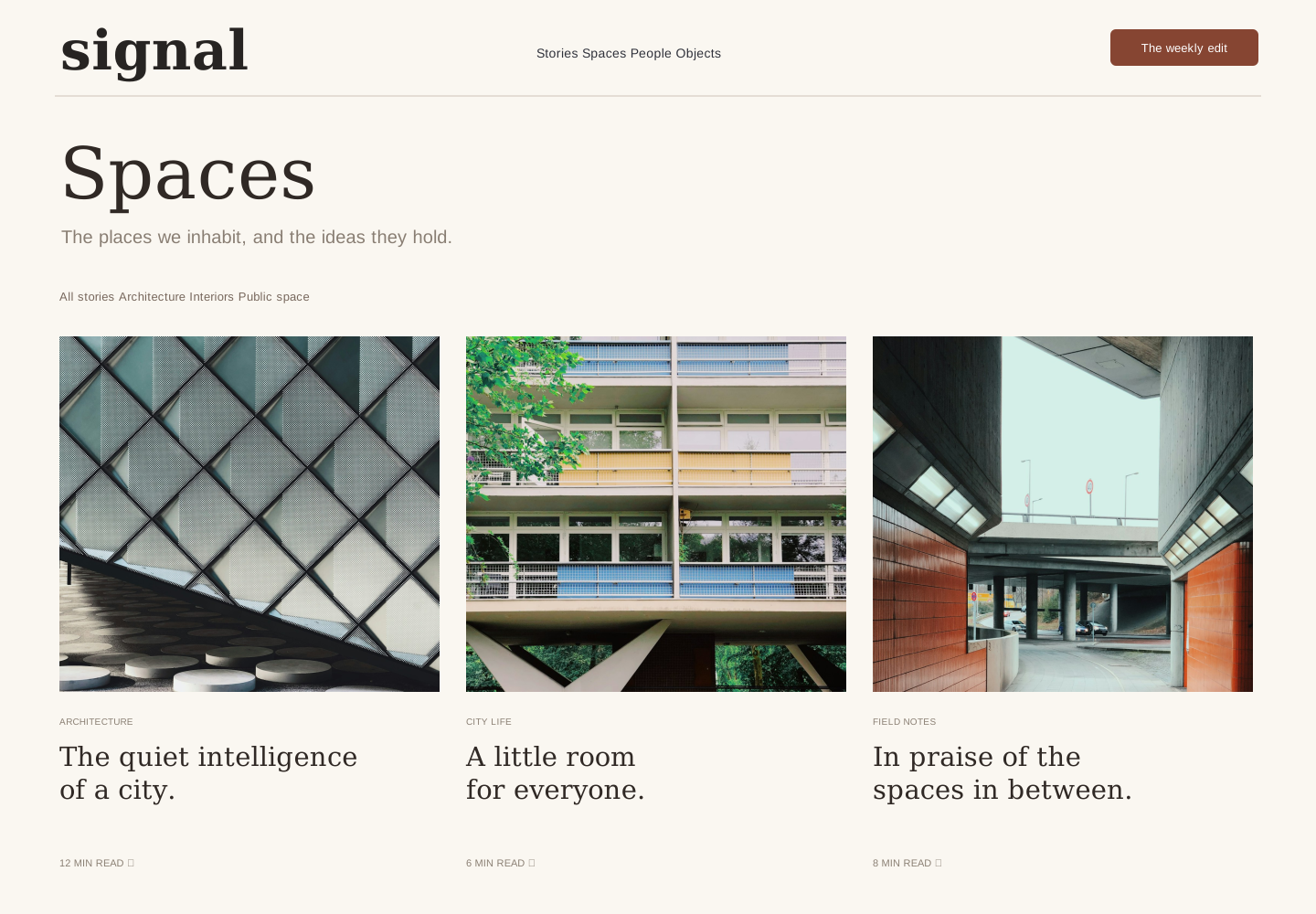
A topic worth exploring
The Spaces collection groups stories through editorial categories and consistent reading cues.
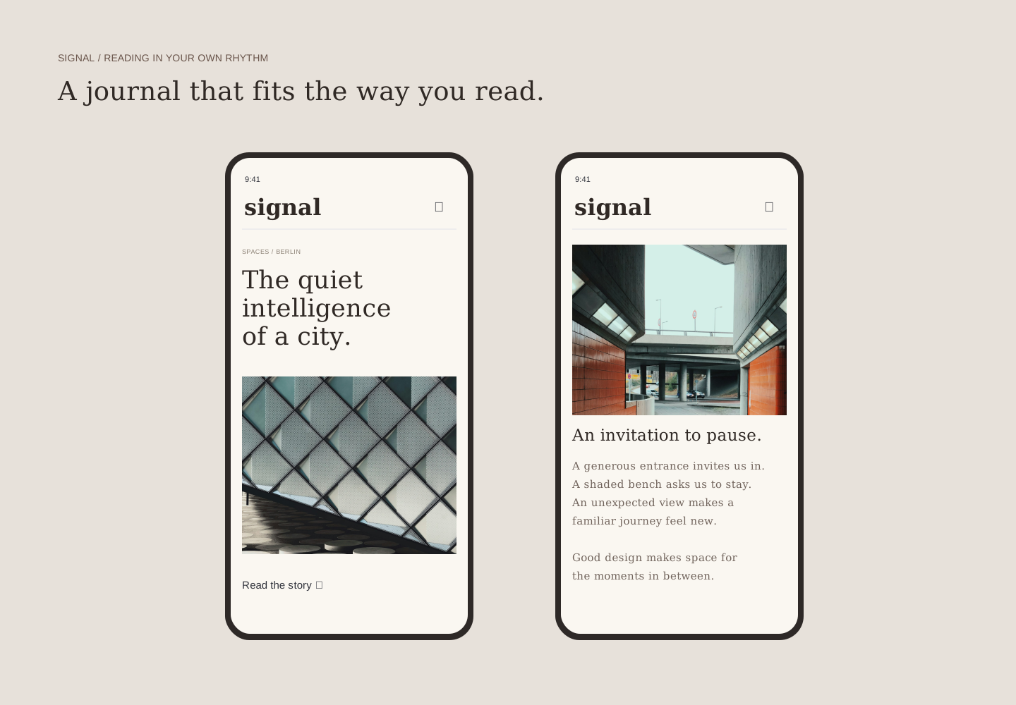
Reading across devices
Mobile home and article views retain their identity while adapting content and typography.
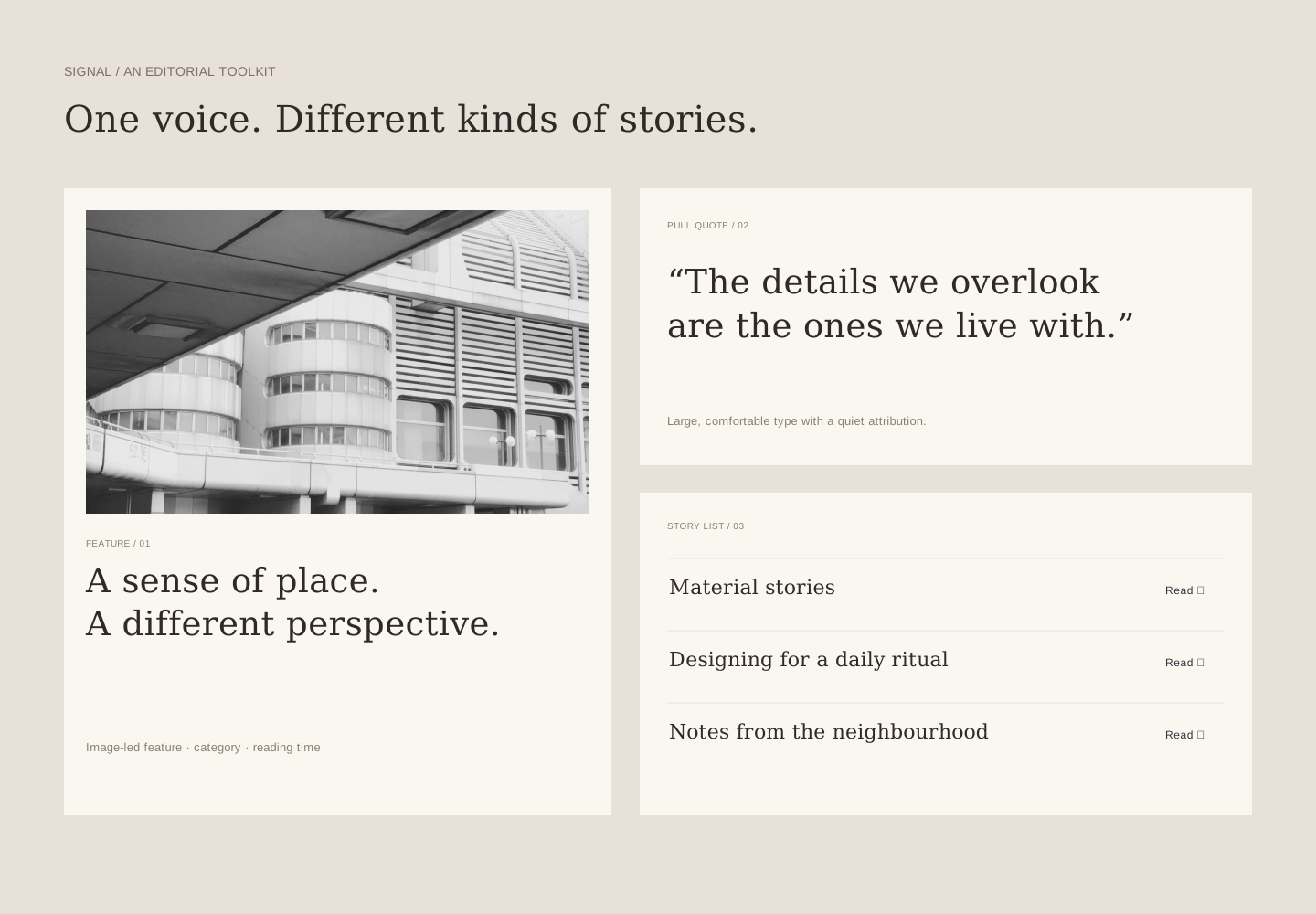
An editorial toolkit
Reusable feature, quotation and list modules make the system practical for recurring publication.
REFLECTION
Where this
goes next.
The study establishes an editorial language across five connected views. A production phase would focus on keyboard navigation, content edge cases and how the templates handle much longer titles or missing imagery.
- Can readers find a topic and return to it easily?
- Does long-form type remain comfortable at larger text settings?
- Can an editor assemble a page without custom layout work?
Photography by Pavel Nekoranec, via Unsplash. Full image credits.